
What's the Difference between Custom and Semi-Custom Wedding Invitations?
It all begins with an idea.
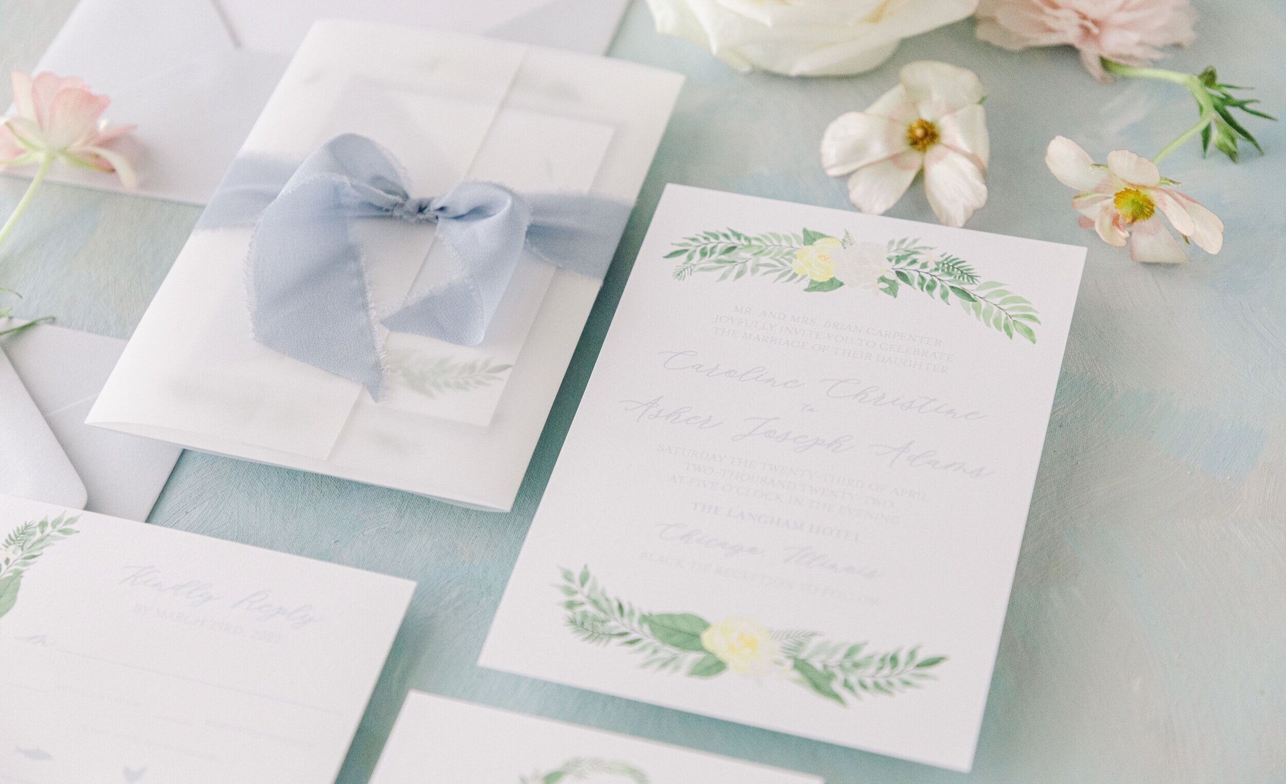
Why do I need custom wedding invitations?
Well, maybe because…
…you want a design that’s unique and perfectly reflects your wedding (not one that thousands of other couples might be using).
…you pay attention to the details, and want your wedding paper to be seamlessly coordinated.
…you don’t want a cookie-cutter wedding.
…you are not an etiquette expert and need help getting it all right.
…you want your invites to be so gorgeous your guests hang on to them.
If any of those sound like you, you’re in the right place!
There are a couple different options for bringing my custom designs to your wedding. Both start with me getting an understanding of you, your sweetie and your wedding vision, so we can create something perfect. Let’s break it down!
Option One: Fully Custom Designs
Fully custom designs start 100% from scratch. All designs and artwork are made just for your wedding. The sky’s the limit - we can create the invitation suite you’ve always imagined (even if you aren’t totally sure what that is)!
Custom clients get a full-service experience, I’ll be there to help make all the big decisions, and create something unique and just right for you.
Fully Custom is perfect for you if your stationery is one of your top priorities and you really want to wow with your invites.
Option Two: Semi-Custom Designs
When I started Crissie Vitale Creative, one of my biggest goals was to make custom design available at more price-points. My Semi-Custom Design option is how I make that happen. For these, we start with one of my pre-designed templates and build from there. I’ll work with you to customize colors and wording to make it perfect for your wedding. You can even add on more custom elements (like a map, or crest!) to give it something extra.
Start off by sending in an inquiry with some basic details and the suite (or suites!) you’d like to start with. Then I’ll send you a custom quote for your selections, and any thoughts needed on customization before I move on the creating your proofs.
Semi-Custom is perfect for you if you want a unique invitation suite, but have a limited budget!
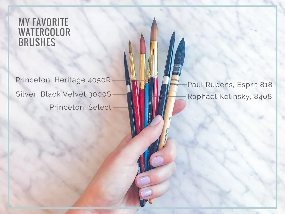
My Favorite Watercolor Supplies
It all begins with an idea.
I’ve been sharing a lot of work-in-progress watercolor paintings over on Instagram lately (follow along here!) and I thought it might be fun to share some of my favorite supplies and resources, in case I inspire any of you to give watercolor painting a try!
I broke up the list by category, and for each category I’m giving you a few options - the higher end/professional products that I use now, and lower price options if you just want to test the waters.
You can find all of this at most art supply stores, but I am also including Amazon links for easy ordering (these are affiliate links, so I’ll get a small commission if you click though and buy anything!)
PAPER
The paper you use can have a big impact on the way your paint behaves, and how much water it can take. I always use Cold Press paper, because I like the texture best. When I’m painting, I use Arches Watercolor Blocks. The Arches paper is thick, and has a nice rough surface that can take a lot of water. “Block” means all the sheets are bound together around the edges, this is great because it keeps your sheet from warping when you add water without having to tape down the page.
When I started out, I used Canson Coldpress paper, it’s lighter weight and smoother than the Arches paper, but still gets the job done!
I do almost all of my painting with round brushes. They have a nice fine tip as well as a full base, making them perfect for painting petals and leaves! My favorites are Princeton Heritage 4050 series, and Sliver Brush, Black Velvet. I’ve listed all the various sizes I use below, but if you want to start small, I recommend a size 12, 8, 4 and 0 (I use those the most!)
Princeton heritage 4050 watercolor brushes:
Size 16 https://amzn.to/2vXUwzW
Size 12 https://amzn.to/3dwT2wO
Size 6 https://amzn.to/2YNGuN5
Size 4 https://amzn.to/33T0kXK
Size 2 https://amzn.to/2WNoaTn
Size 0 https://amzn.to/2Jxqmqx
Silver Brush, Black Velvet set: https://amzn.to/3duhKi5
Paul Rubens Mop Brush: https://amzn.to/3cif1Y0
If you’re not ready to invest in bushes yet, here’s a set of round brushes in various sizes: https://amzn.to/2YKSDCx
PAINT
The watercolor paints that I use aren’t what you used in elementary school art class! I use paints that come in tubes, not trays! You squeeze a small amount of the pigment out of the tube, mix it with water and start painting! There are 3 main brands that I use - Winsor Newton, Daniel Smith and Holbein. There are SO MANY color options for each, but here is a good list of basics to get you started:
-Winsor Newton Opera Rose
-Winsor Newton Lemon Yellow Deep
-Winsor Newton Scarlet Lake
-Winsor Newton Permanent Sap Green
-Winsor Newton Sepia
-Winsor Newton Mars Black
-Winsor Newton Raw Umber
-Winsor Newton Burnt Sienna
-Winsor Newton Winsor Blue (red shade)
I buy the 5ml size, and they last a long, long time! You only have to use a very small amount of paint to get a good color.
TOOLS
OK! So, now we have paper, brushes and paint! Just a few more things you’ll need to get going.
A Pallette - something to mix your paint on! You don’t have to buy anything fancy, you can just use a plate of tray. I use a few different palettes, listed below!
You’ll also want to have paper towels and a couple jars or cups for water (I use 3 - one for cool colors, one for warm colors and one with clean water).
And, if you really want to get into it! Here are a few books that I have used while learning to paint:
Wedding Invitation Design Mistakes & How to Avoid Them
4 wedding invite mistakes to avoid!
The origin story of Crissie Vitale Creative starts with the story of my own wedding invitations.
I had always been a big fan of gorgeous paper, so when it came time to plan the invitations for our wedding, I knew I wanted something unique that really reflected what our wedding was going to be. Invitations are the first tangible experience your guests have with your wedding - and I knew (even back then!) how important that was!
But everywhere I looked for invites I came out disappointed. Things were either too generic, too expensive, or just poorly designed. I decided the only way to get them right was to do them myself, turns out I was right - and wrong, in a lot of ways.

Let’s start on a positive note!
WHAT I DID RIGHT:
I worked with a designer for our monogram.
I knew I wanted a central element that would live across our wedding paper and signage. I wanted it to be unique, and was not confident in my own artistic abilities at that point (I still believed the myth that if you had bad handwriting you wouldn’t be good at calligraphy). So I had Mel Chiusano design that piece for me.
I cared about details.
I wanted all the bells and whistles to make our invites truly special. Paper weight was super important to me (and still is!) having envelope liners, varied card sizes, a way to hold the suite together and euro-flap (non-white) envelopes were all on my must have list.
I committed the time.
I spent ALL of my free time working on these. From designing, to sourcing paper and envelopes, to problem solving (keep reading for the problems!!), to assembling (Liners! Twine! Double envelopes!), to hand addressing every envelope (oh, AND learning calligraphy first), the time commitment to get these right was huge. This helped me realize WHY custom invitations cost what they do. You not only pay for great design, but a lot of hard work and time! (Stay tuned for a blog post all about pricing!)

OK, now for the fun part.
LET’S TALK ABOUT WHAT I DID WRONG:
Over-ordered. By A LOT.
Let’s start with the Save the Dates.
First of all, I ordered enough Save the Dates for each individual person invited to the wedding to receive one instead of ordering one per household like I should have. I still have a HUGE stack of extra Save the Dates (as you can see in the photo on the left.)
Quick tip for you: A good way to estimate how many invitations you need is to divide your total guest count in half and add 25.
Didn’t start with a clear vision.
I also felt rushed sending these out - so I didn’t have a vision for the rest of the suite when I created them. Not 100% a bad thing - in my custom process I often design the Save the Dates months before the invitation suite, but I also have a good feel of there I want the rest of the design to go. Our save the dates were printed on a totally different color paper, and the foliage elements were a much brighter green than where I ended up for the rest of the suite. They still look like they are in the same family - but I wish they were a bit closer to the final look. Working with a designer for your full suite will help you keep a cohesive design from start to finish!
Had a few sizing snafus.
The 5x7 invitations I ordered from a cheap DIY site where I could upload my design were not actually 5x7 at all but 4.75 x 7.25. (In retrospect I should have caught this before I ordered when I had to resize my final art file - but I thought it was just some weird print file set-up thing, how was i to know any better!? The site said 5x7!)
Because of that extra .25 inches in length, my beautiful double-thick invite cards did not fit into the envelopes I had specially ordered from a different vendor. To solve this issue, I decided to re-order larger envelopes, which was cheaper than re-printing the cards and felt a lot safer than trying to evenly cut them all down to size. But since I was doing an inner and an outer envelope (like I said - I was all about the extras!!) I had to find new sizes for BOTH sets of envelopes! Ugh!

Letterpress Printing 101 & An Elegant Brooklyn Wedding
An Elegant Brooklyn Wedding.
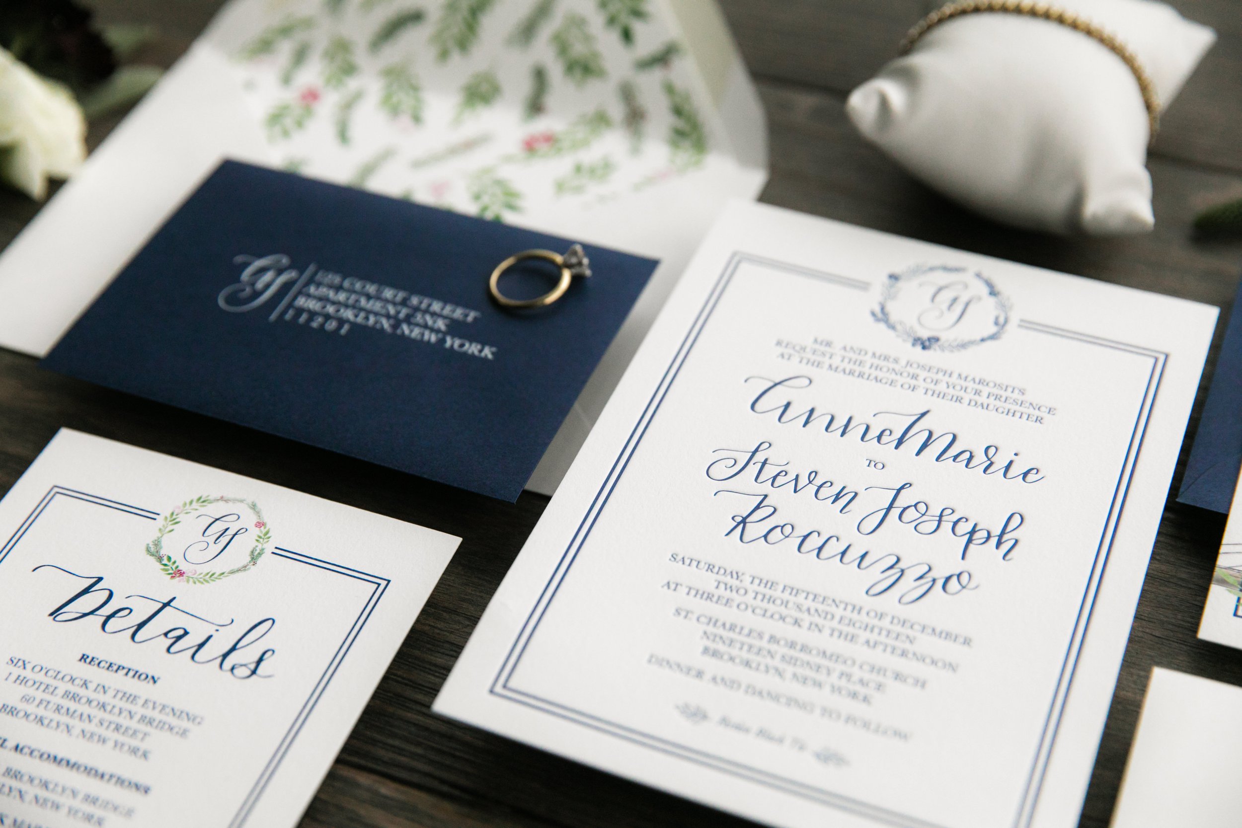
Photo by Michael Justin Studios
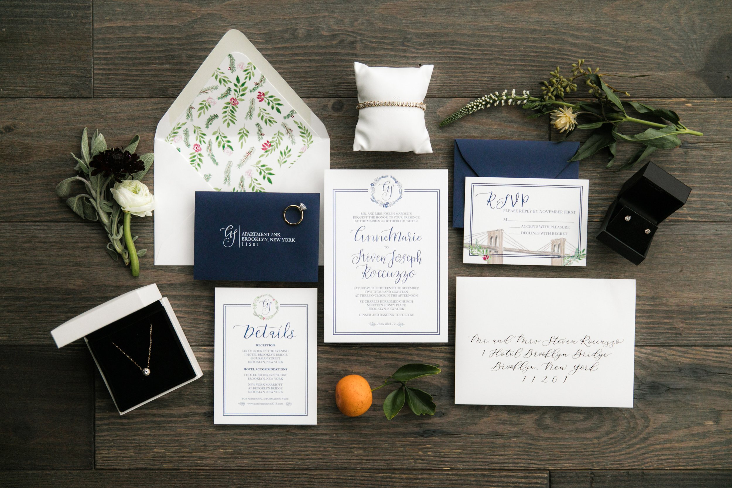
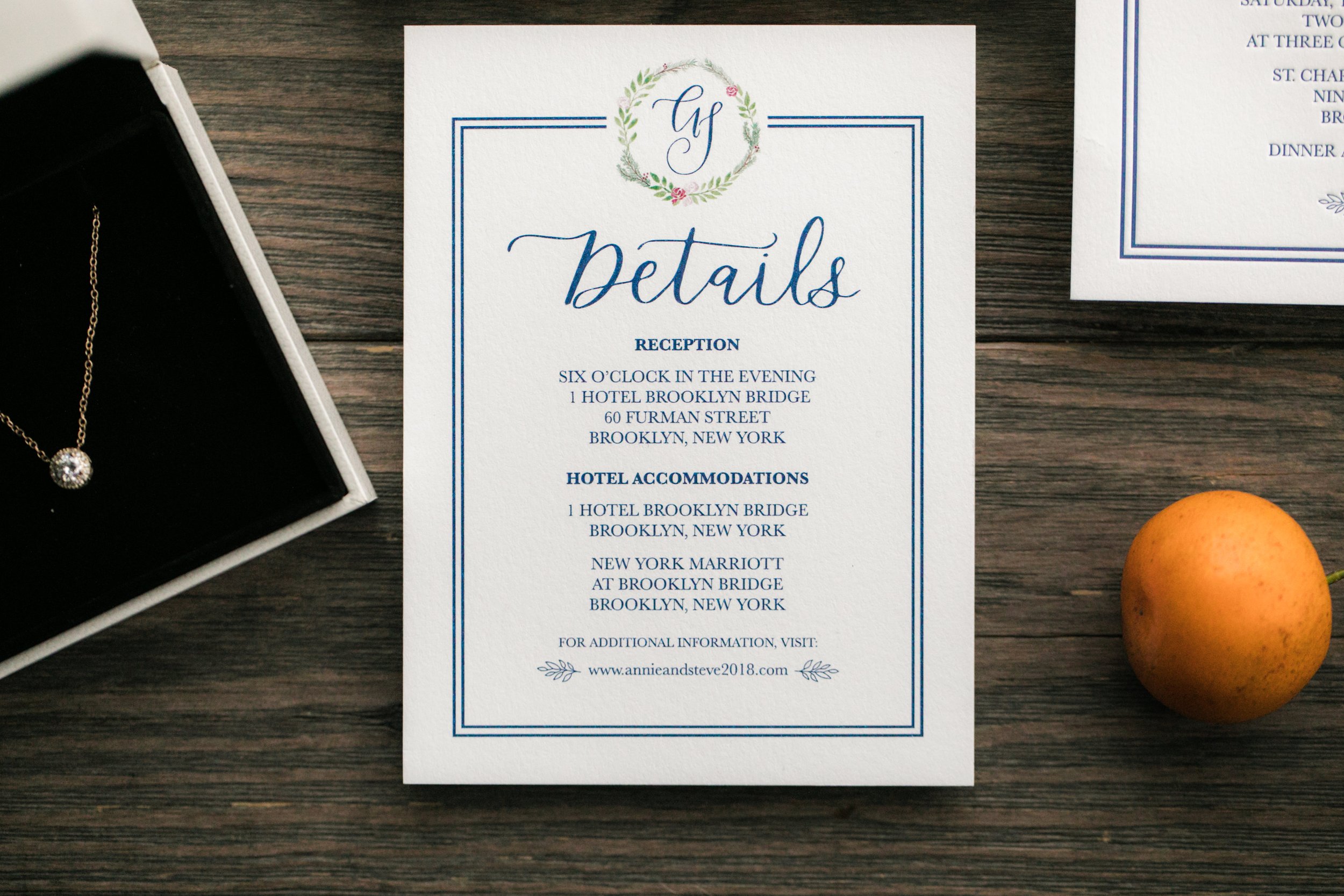
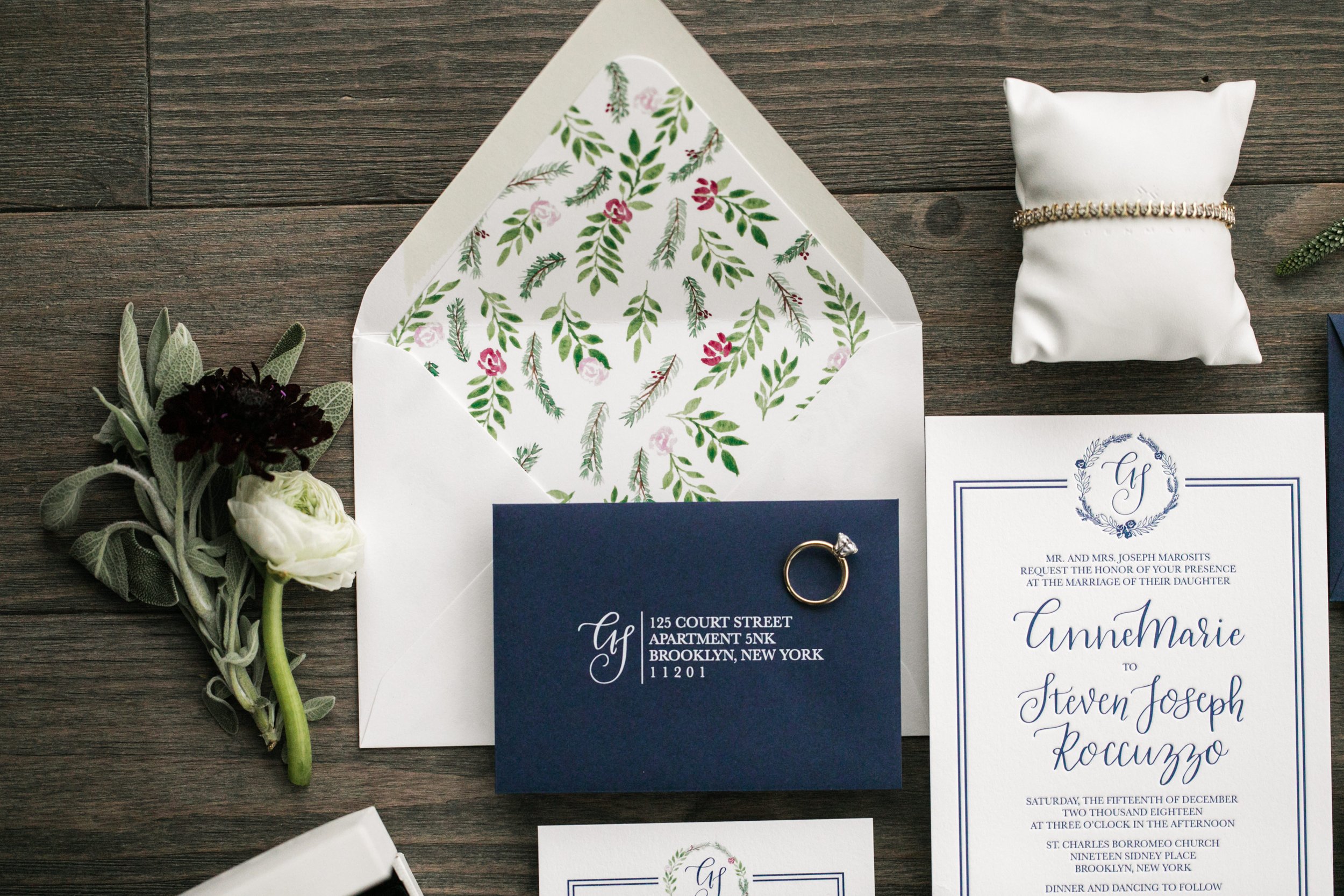
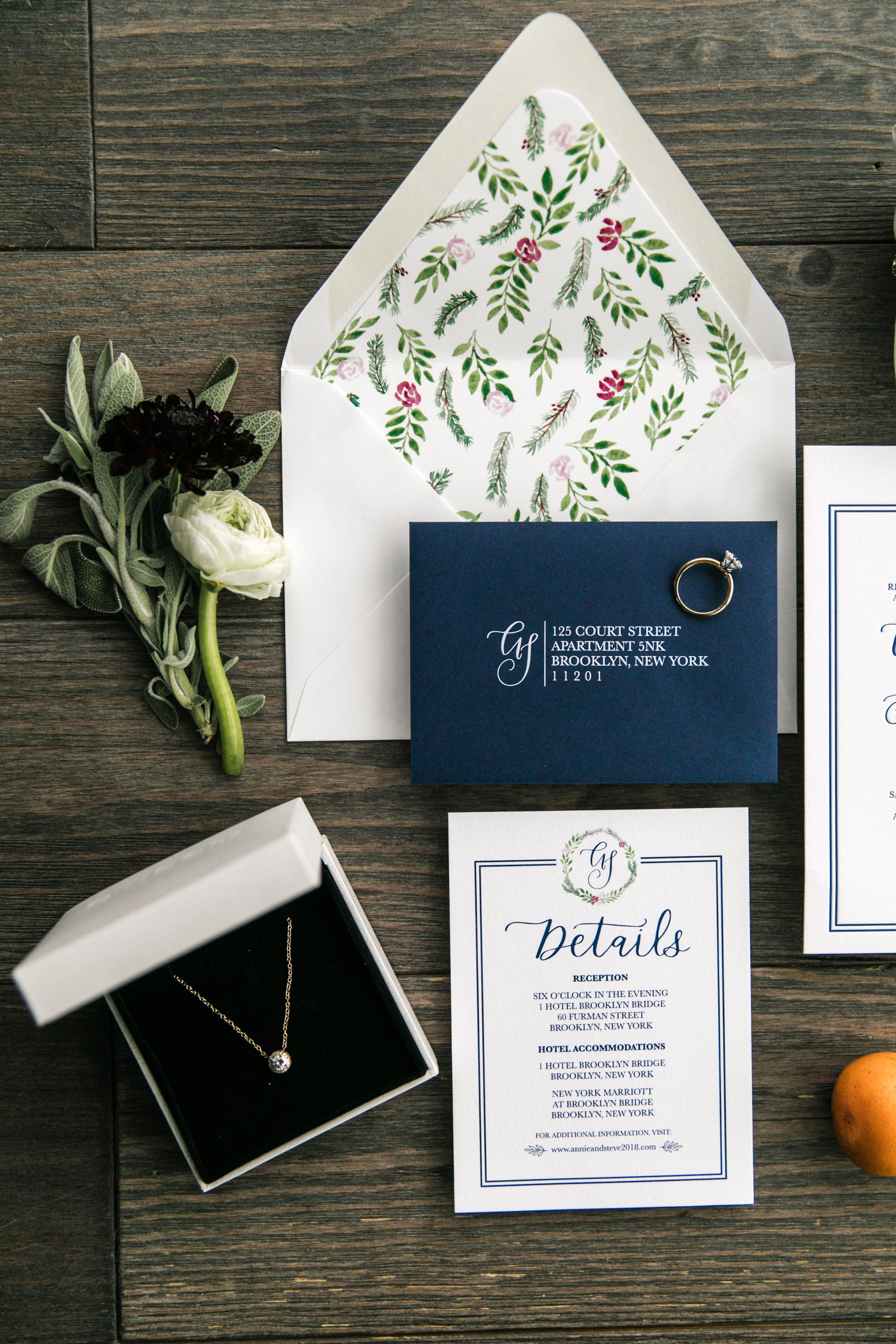
Before we dive into the gorgeousness that is this Brooklyn wedding, I wanted to chat a little bit about letterpress printing. I have long been obsessed with all things letterpress (even before I got into the stationery game…!) Letterpress is a super old-school printing method where you use polymer plates to imprint (press!) your design (with or without ink) onto paper. It’s so beautiful and super elegant - so when Annie asked about letterpress printing for her custom invitation suite I was all for it!
Letterpress came to be in 1440 (told you it was old-school!) and originally used single letter blocks - or movable type - that printers would use to form words and print books and newspapers. Movable type had been around for a while already - it was invented in 1040 in China, using ceramic tile. But Johannes Gutenberg gets credit for inventing modern letterpress with his wood blocks and a wine press.
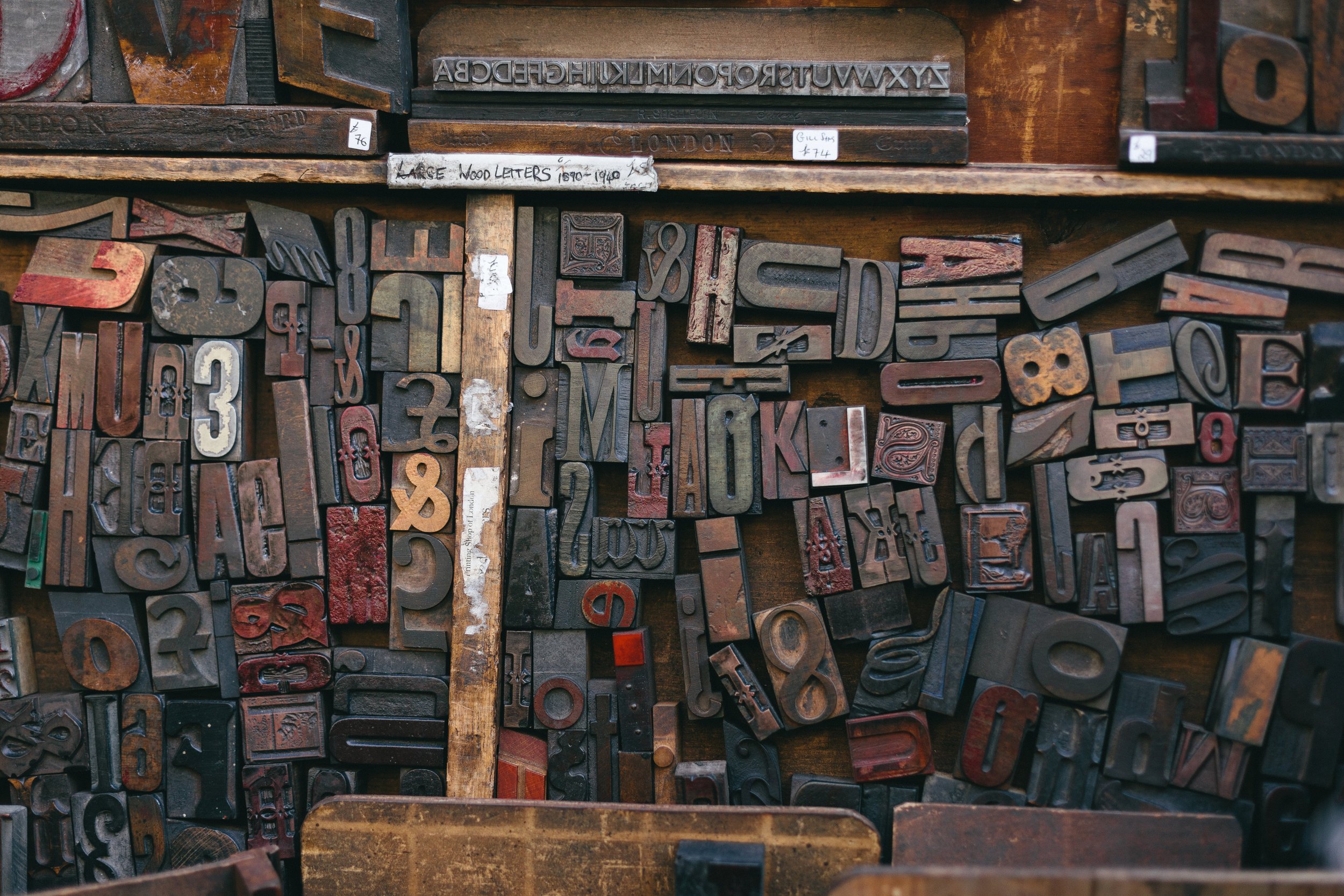
Moveable Type, Photo by Bruno Martins on Unsplash
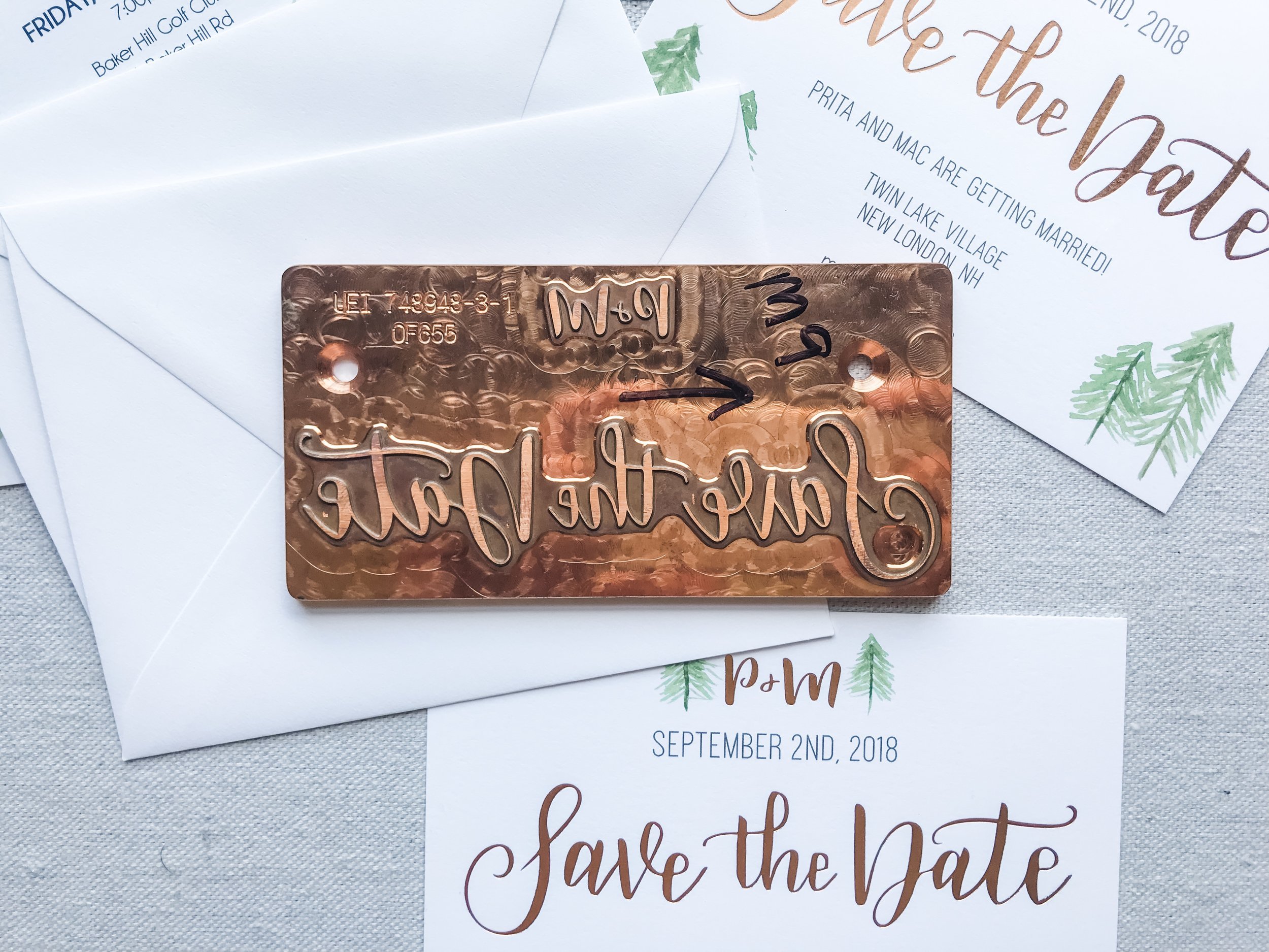
For wedding invites these days, we use plates to create the design impressions. Here’s one that was made for a save the date (this one was actually for foil stamping - so it is copper, letterpress plates are very similar but usually polymer since they don’t get hot like with foil.)
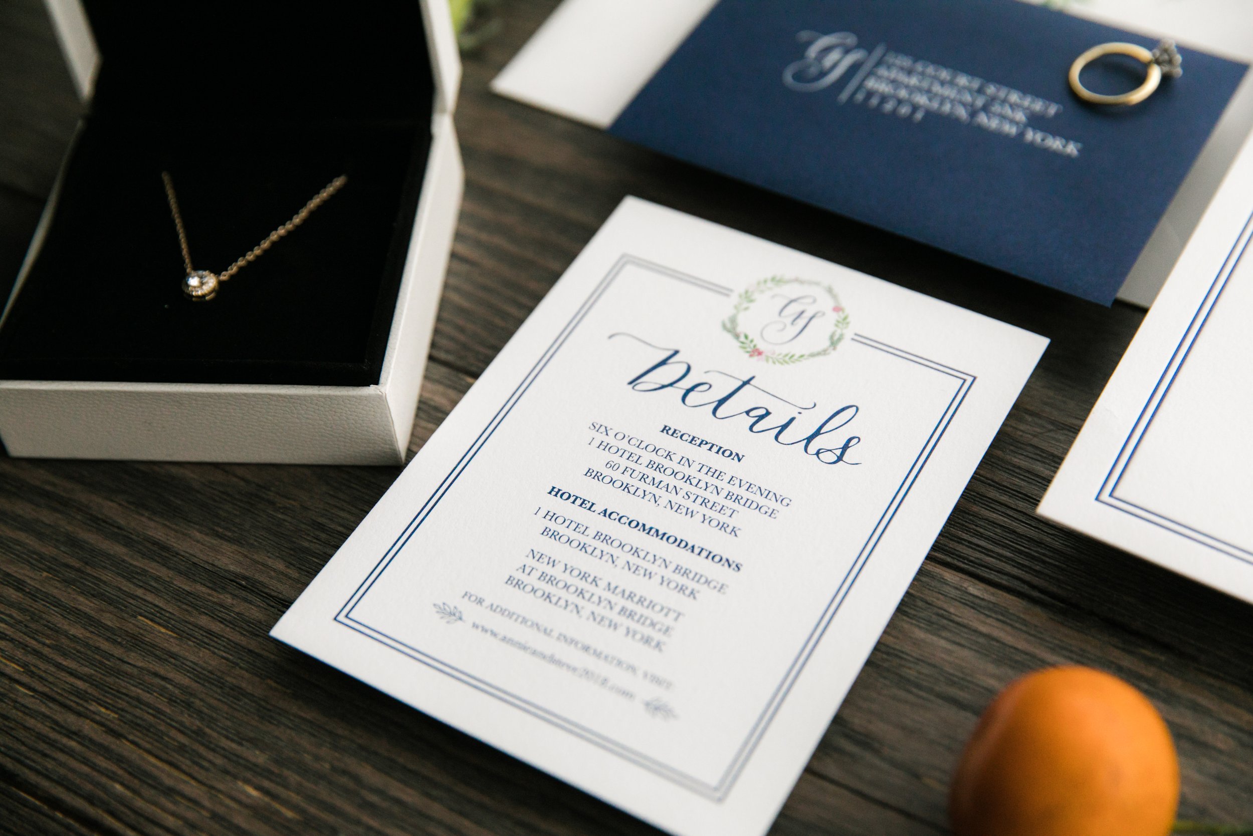
With letterpress, you have to print each color individually - which can get pretty pricey. So, for Annie, we did a one color letterpress invitation that was supplemented with digitally printed RSVP and details cards, and an envelope liner to bring more colors into the suite. The result was the perfect mix of elegance and whimsy for her December wedding in Brooklyn, NY. Here are some photos from the day, taken by Michael Justin Studio. (click a thumbnail to open the gallery)

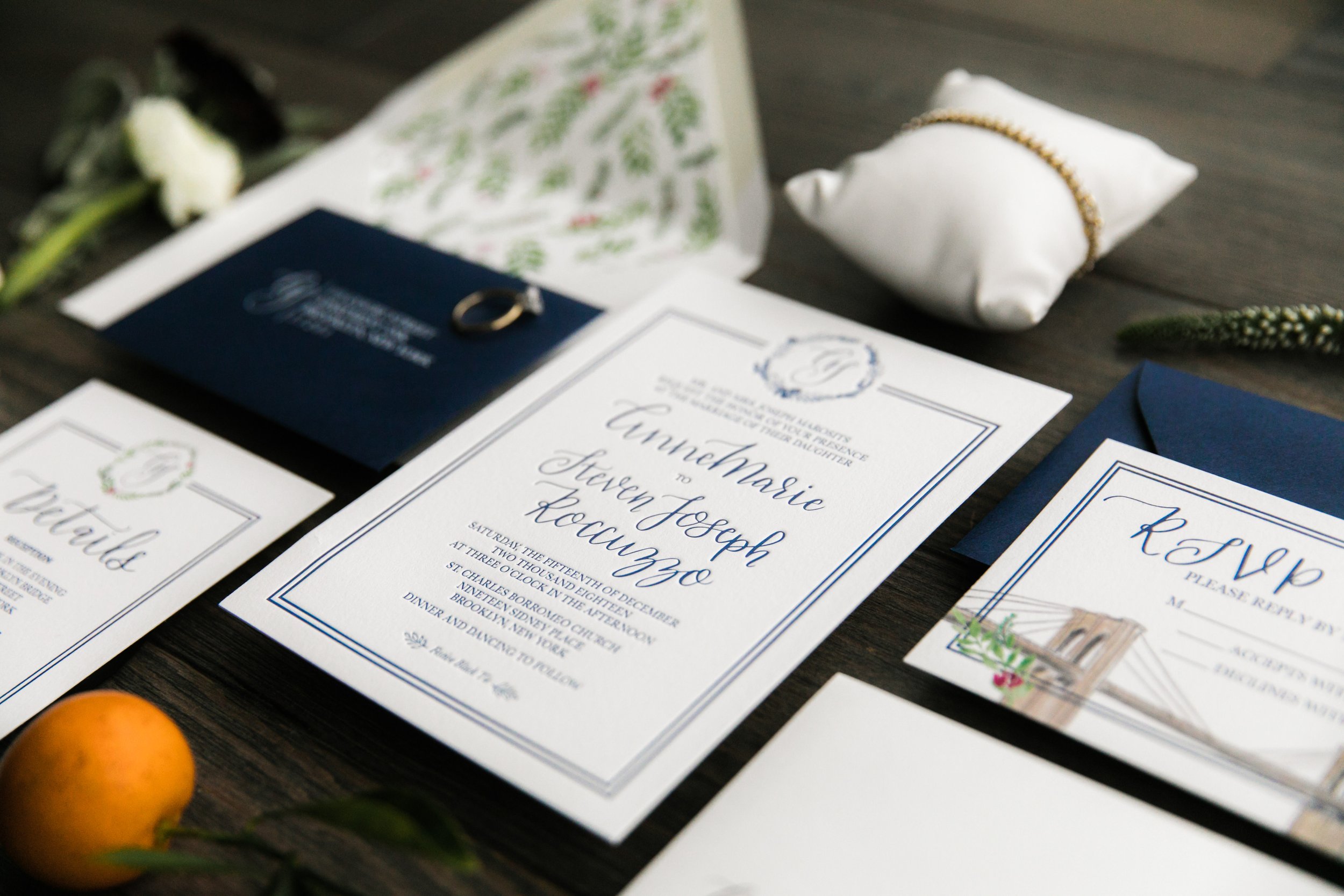
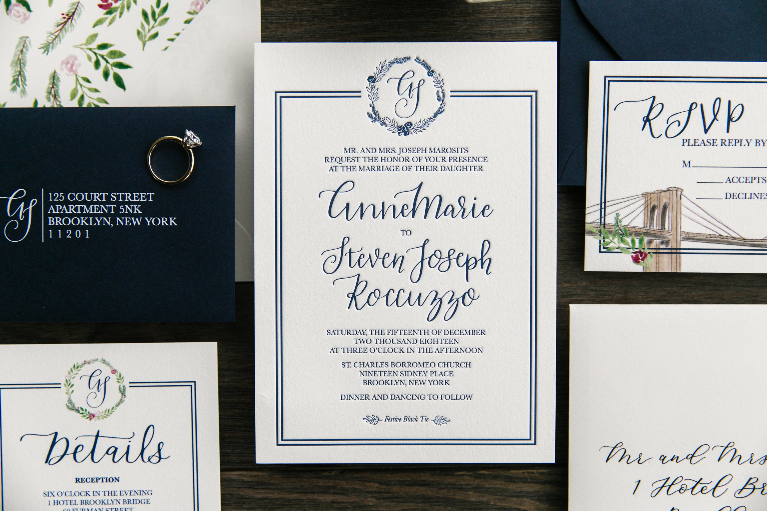
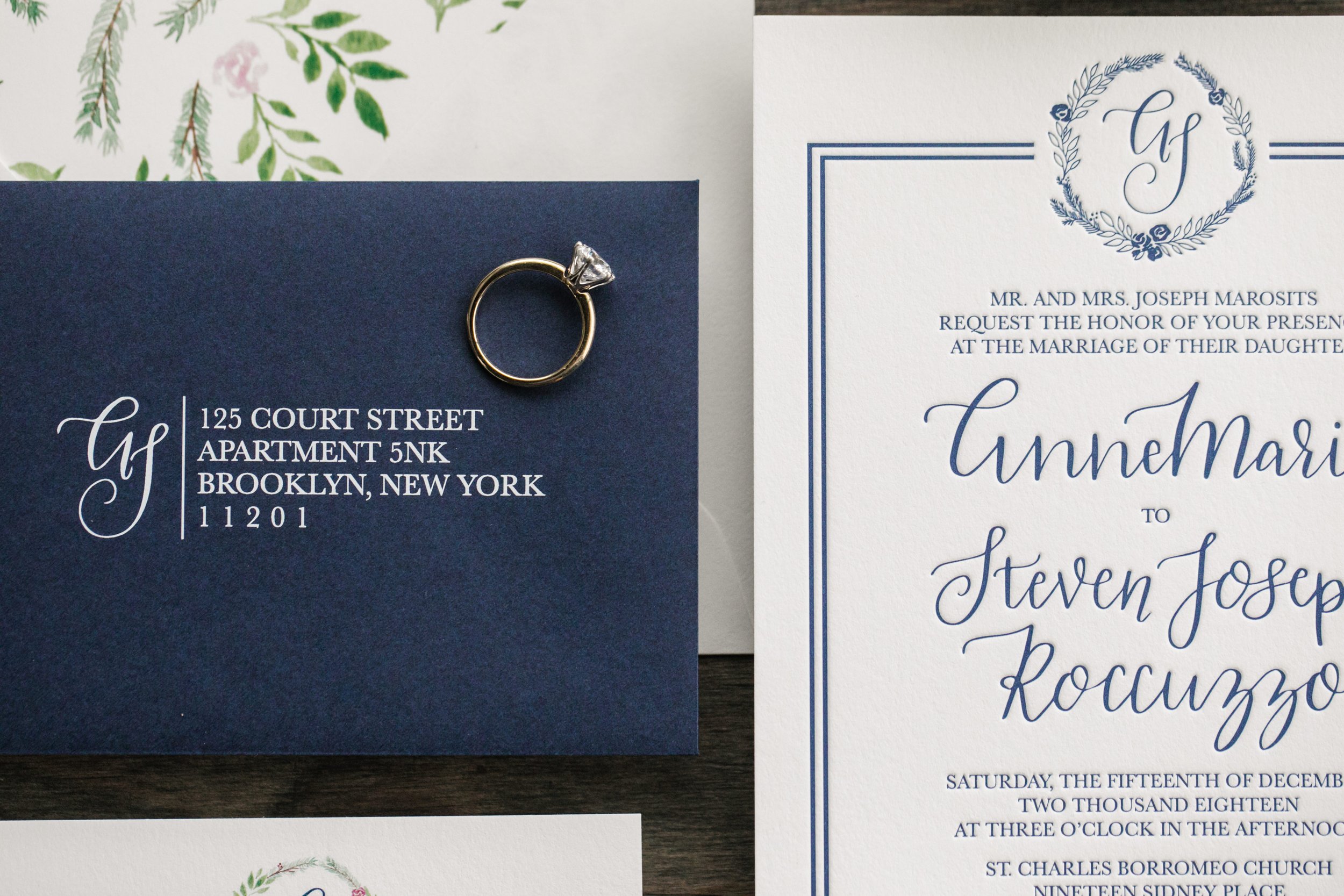
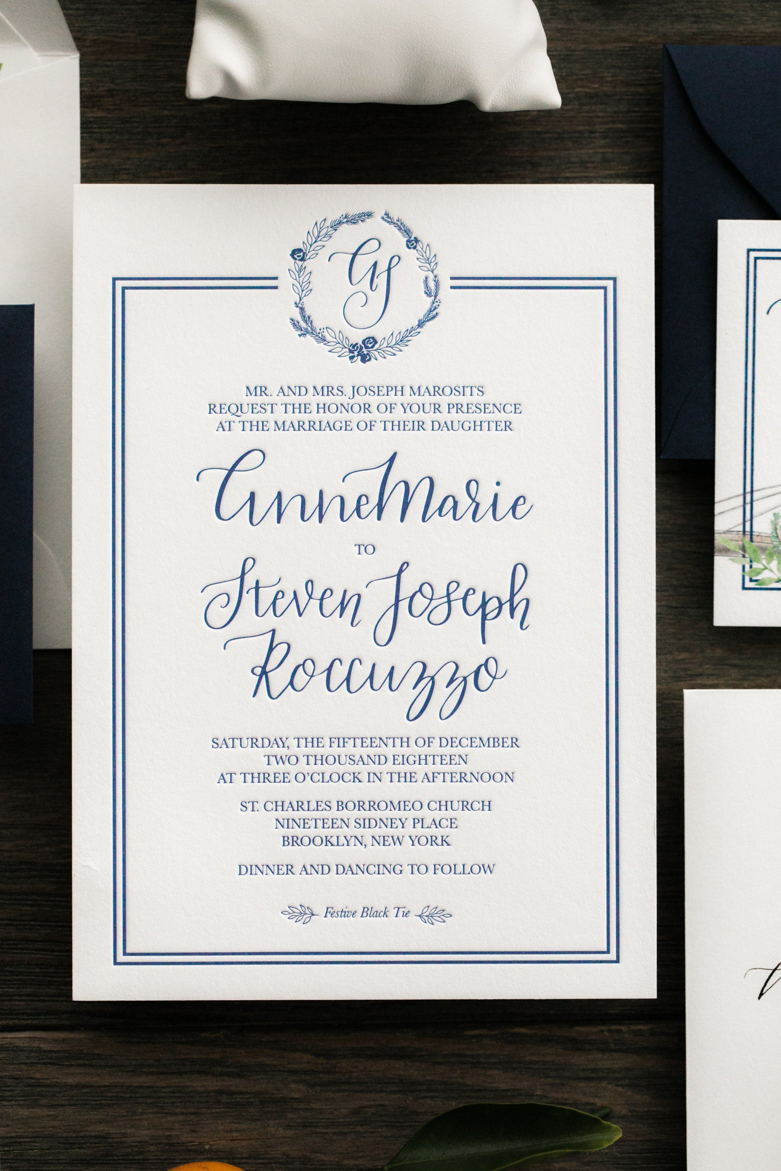
I worked with Steracle Press here in Chicago to get these printed - and they did such an amazing job.
Get in touch HERE if you are interested in letterpress for your custom invites and we can chat all about the process and resulting prettiness!